Wall Art Placement
It's Farmhouse Friday, and today we are bringing some "Do's and Don'ts" of Wall Art Placement when regarding larger furniture! Think Sofas, benches, dinning room tables, and headboards here.
Do you need guidance for your clients on what sizes to choose? How high should they be hung? Where to place them? These are questions that most clients have, and today's blog post provides some quick full proof tips that can be passed along!
Tip # 1: The Most important...FILL THE SPACE!!!
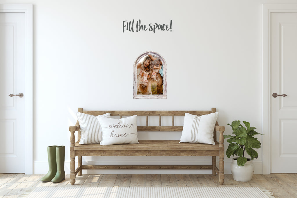
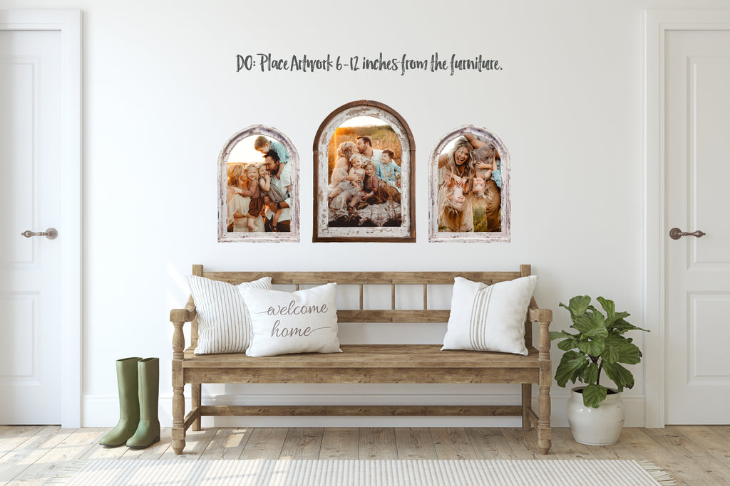
Your wall art should generally fill a large portion of the wall space you are hanging it on. You want to make sure it's balanced and cohesive, and to do this you need to FILL THE SPACE! If you have a large wall area to fill, then collections are a great way to achieve this! Below is an example of a single 12x18 arch as well as a wall art collection that show how "filling the space" is essential.
You can clearly see how the first image with the single 12x18 Arch is lacking in balance.
And now....The Collection! This includes a 16x24 Vintage Arch that is flanked by two 12x18 Arches. Well balanced and grounded.

Tip #2: Placement -Vertically
When Hanging Artwork above furniture, there are some really simple rules that you can follow for correct placement. First, hang your wall art 6-12 inches above your furniture. This will keep everything balanced vertically and for the most part keep everything at the correct eye level. Below you can see the huge difference this makes in the vertical (floor to ceiling) feel of things.
The first Image feels top heavy

But....by keeping the images closer to the furniture, the second example feels like everything is balanced!
Tip #3: Placement- Horizontally.
When hanging artwork keep your images spaced around 3-4 inches apart from each other. You should also make sure that your furniture is slightly longer than your artwork. Think of a triangle. Your eye naturally wants to start at the tip of the triangle and work it's way down. This is how your eye should move when regarding wall art that is placed above furniture. This may require adding or subtracting a piece.
This first image shows how spacing art too far apart, and beyond the length of the furniture, throws the entire balance of the wall off. Your eye is moving all over the place.

And now.....spaced 3-4 inches apart with the furniture longer than the wall art. Creates a slight triangle for your eye to follow.

So there you go! Some very easy, but hugely important tips on wall art placement!

Another "DO" example with our Wood Retro Frames below. <3


